- August 25, 2025
- 0 Comments
- By Admin
In today’s competitive digital world, choosing the right approach for your website’s design can make or break your online presence. Many businesses across New Hampshire — from Manchester to the Lakes Region — are exploring whether Responsive Website Design or Adaptive Design is the best fit for their goals. If you’re planning to build or revamp your site, understanding the difference between these two approaches is essential.
In this guide, we’ll break down what responsive and adaptive designs mean, compare their pros and cons, and help you decide which one works best for your business — whether you’re a small local shop in the Lakes Region or partnering with a leading Website Design Company New Hampshire.
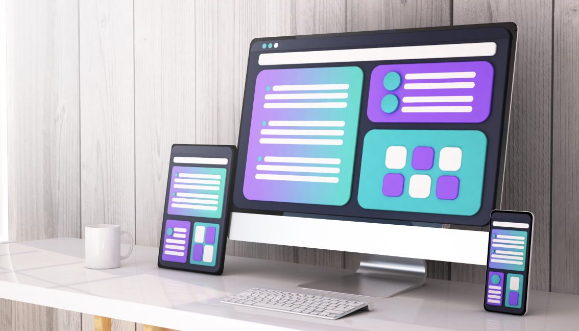
What is Responsive Website Design?
Responsive Website Design is a design approach where your website automatically adjusts its layout and content to fit any screen size — desktop, tablet, or mobile. This is done through flexible grids, fluid images, and media queries.
When you work with a Website Design Company New Hampshire, they often recommend responsive design because it provides a seamless experience for users, regardless of the device they use.
Why Responsive Website Design Matters
Today, more people browse the internet on mobile devices than desktops. If your website doesn’t adapt smoothly to different screens, you risk losing visitors and potential customers. Businesses looking for Responsive Website Design Manchester or Responsive Website Design Lakes Region often choose this method to ensure their customers have a positive, consistent browsing experience.
What is Adaptive Website Design?
Adaptive Design, on the other hand, uses multiple fixed layout sizes. When a user visits your site, it detects the screen size and loads the appropriate layout. This approach is slightly older than responsive design but can still be effective when done right.
For example, an adaptive site may have separate layouts for smartphones, tablets, and desktops. Each layout is specifically crafted, offering more design control but requiring more work during development and maintenance.
Responsive Website Design vs. Adaptive Design: Key Differences
Understanding the main differences will help you determine which method suits your goals.
1. Flexibility
Responsive Website Design uses a single layout that fluidly resizes for any screen. Adaptive design uses multiple static layouts. If your audience uses a wide range of devices, responsive design ensures your site looks good on all of them.
2. Development Time and Cost
Responsive design is generally more cost-effective in the long run. Once built, it requires less maintenance compared to adaptive sites, which need multiple layouts updated and maintained.
Businesses that want an affordable, future-proof solution often search for Responsive Website Design New Hampshire to find local experts who can build a flexible site.
3. User Experience
With responsive design, your site delivers a consistent experience across all devices. Adaptive design can offer more tailored experiences, but gaps can appear when a device screen size doesn’t match any predefined layout.
4. Performance
Adaptive design can load faster on specific devices because only the required layout is served. However, modern responsive sites are designed to be lightweight and perform well on all devices.
Benefits of Responsive Website Design for Businesses in New Hampshire
From small businesses in the Lakes Region to startups in Manchester, more and more companies prefer Responsive Website Design for good reasons.
1. Google’s Preference
Google recommends responsive design because it’s easier for its algorithms to crawl and index content. A responsive site has a single URL and the same HTML, making SEO stronger and maintenance simpler.
If you want to rank well locally, choosing a Website Design Company New Hampshire that specializes in responsive design can give you an edge.
2. Better User Engagement
A seamless experience across devices keeps visitors on your site longer. This reduces bounce rates and increases the chance of converting visitors into customers.
Whether you’re offering services in Manchester or targeting tourists in the Lakes Region, Responsive Website Design Lakes Region ensures your site is always user-friendly.
3. Easier Maintenance
With responsive design, you don’t need to manage multiple versions of your website. One site works for all devices, saving you time and money on updates and content management.
When Adaptive Design Might Be Right
While responsive design is the popular choice, adaptive design still has its place. Here’s when it might work better:
- Legacy Sites: If you already have a desktop website and want to add mobile support without rebuilding everything, an adaptive layer can be quicker to implement.
- Complex Customization: For certain industries that need highly customized experiences for specific devices — like unique interfaces for kiosks or tablets — adaptive design gives designers more control.
- Performance Focus: In some cases, adaptive design can deliver better loading speeds because it loads only the assets needed for each device type.
How to Choose the Right Website Design Approach
Choosing between responsive and adaptive depends on your goals, audience, and budget. Here are a few questions to guide your decision:
1. Who is Your Audience?
Check your website analytics. Are your visitors mostly on mobile, desktop, or both? If your traffic comes from various devices, Responsive Website Design New Hampshire experts will likely recommend a responsive approach.
2. What’s Your Budget?
Adaptive design can require more upfront and ongoing investment since you’re designing and maintaining multiple layouts. Responsive is more cost-effective for small and medium businesses.
3. What Are Your Goals?
If you’re planning to scale your business or attract a wider audience in Manchester, the Lakes Region, or anywhere in New Hampshire, responsive design offers flexibility and scalability.
How to Get Started with Responsive Website Design in New Hampshire
If you’re ready to invest in a better website experience, partnering with a trusted Website Design Company New Hampshire is the best first step. A professional team can:
- Analyze your audience and competitors.
- Recommend the right design approach for your goals.
- Build a responsive website that’s fast, SEO-friendly, and easy to manage.
Whether you’re located in Manchester, Concord, the Lakes Region, or beyond, having a local expert helps you tailor your website to your customers’ needs.
Why Local Matters: Working with a New Hampshire Website Design Company
You might wonder, why hire a local Website Design Company New Hampshire instead of outsourcing overseas?
- Better Communication: Local companies understand your community and are easier to reach.
- Faster Turnaround: Time zone and cultural alignment mean fewer delays.
- Local SEO Advantage: They understand how to optimize your site to attract customers in the Lakes Region, Manchester, or anywhere in New Hampshire.
Best Practices for a Successful Responsive Website Design
If you decide that responsive is the way to go, keep these best practices in mind:
1. Mobile-First Design
Start designing for the smallest screens first, then scale up. This ensures your content and functionality work well on mobile — the device most people use today.
2. Optimize Images
Use flexible, responsive images that adjust to different screen sizes without slowing down your site.
3. Prioritize Speed
A responsive website should load quickly on any device. Compress files, leverage caching, and use a content delivery network (CDN) if needed.
4. Test Across Devices
Always test your site on multiple devices and browsers. A reputable Website Design Company New Hampshire will handle thorough testing before launch.
5. Keep It Simple
Clean layouts, clear navigation, and legible fonts ensure your site is user-friendly on every screen size.
Future-Proof Your Website with Responsive Design
With changing technology and new devices launching every year, responsive design remains the best way to future-proof your site. It automatically adjusts to new screen sizes without requiring a major overhaul.
So, whether your business serves customers in Manchester, the Lakes Region, or anywhere across New Hampshire, investing in Responsive Website Design keeps you ahead of the curve.
Final Thoughts: Which One Should You Choose?
To sum it up — for most businesses today, Responsive Website Design is the clear winner. It’s flexible, cost-effective, and favored by search engines like Google.
However, there’s no one-size-fits-all solution. If your business has unique needs or an existing website that can’t be rebuilt right away, adaptive design might still be the right choice in the short term.
The best way to make the right decision is to talk to a trusted Website Design Company New Hampshire. They can analyze your goals, audience, and budget — and guide you to the perfect solution for your business.
Ready to give your customers the best browsing experience, no matter where they are? Make the smart move — invest in Responsive Website Design Manchester, Responsive Website Design Lakes Region, or wherever your business needs to grow.
Are you looking for a responsive website that drives real results? Connect with an expert today and take the first step toward a site that works beautifully — everywhere.